UI/UX overhaul
Haiku Topic Engine » Devlog


Haiku Topic Engine now boasts a much sleeker appearance and user experience. Here's what's new in this major update:
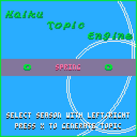
- Easier controls: The superfluous key presses of the older version have been removed. Now the main menu has a much more intuitive mechanism for selecting a season.
- Prettier menu: Instead of a dull black background, the menu page now simulates ripples on water, adding some life to proceedings.
- Improved summer palette: Instead of the dark greens and muddy browns of the old version, the summertime palette now uses soft yellows and greens.
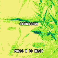
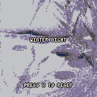
- Animated backgrounds: The background image for each season now has some unobtrusive pixel animations that add energy and visual interest to the kigo display.
(If you happen to prefer the older version/palette, message me. I can send you a custom version with the colors and interface you like better.)
I am working on a new update that will expand the engine's list of season words, but I do not currently have a timeline for completing this.
Files
haiku_topic_engine_web.zip Play in browser
Jun 02, 2024
haiku_topic_engine_windows.zip 996 kB
Jun 02, 2024
haiku_topic_engine_linux.zip 758 kB
Jun 02, 2024
haiku_topic_engine_osx.zip 7.3 MB
Jun 02, 2024
haiku_topic_engine_raspi.zip 2.1 MB
Jun 02, 2024
Get Haiku Topic Engine
Buy Now$2.00 USD or more
Haiku Topic Engine
Summon a seasonally-appropriate word to help you write haiku.
More posts
- Content update and bug fixesJun 19, 2024
- Major content updateJun 05, 2024

Leave a comment
Log in with itch.io to leave a comment.